• Home
  • Images of the Month
  • My Notes
  • About
  • Contact
    • Privacy Policy

iJourneys

John Gough Photography

Remembering Martin Parr

by John Gough

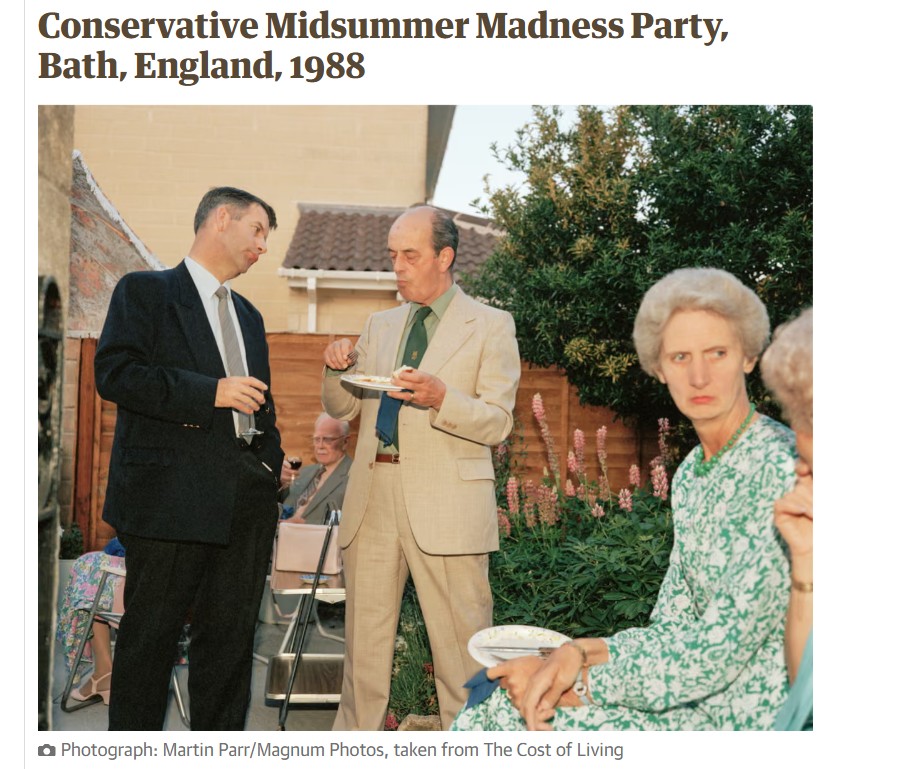
Martin Parr sadly died a few days ago at the age of 73.

I was lucky enough to meet Martin Parr a couple of times, he was the most unassuming and genial ambassador for photography. A genius who captured the essence of Britishness, illustrated by the image I have included above. This is one of my favourite Parr photographs.

So much will be written about his photography, but to me his legacy is that he gave us all the permission to photograph ordinary people, doing mundane things.

My condolences to his family, and I am grateful that his work will live on through the Martin Parr Foundation https://martinparrfoundation.org/

Filed Under: Photographer, Photography

Let them Shoot JPEGS

by John Gough

Posted by Glyn Dewis. https://www.instagram.com/glyndewis/

I do despair of photographers who ‘boast’ about getting it right in camera. It is like shooting a movie without editing or post-production. I have yet to see an image that could not be improved with a bit of Lightroom, or dare I say it, a touch of AI.

Filed Under: Journey

I Am Martin Parr

by John Gough

I Am Martin Parr: A Colourful Look at a Controversial Photographer

A new documentary, “I Am Martin Parr,” takes an intimate look at the life and work of one of photography’s most distinctive and controversial figures. Known for his up-close, saturated color images of everyday life, Martin Parr has spent decades capturing the quirks and eccentricities of consumer culture.

The film, directed by Lee Shulman, offers viewers a unique road trip across England with Parr, exploring the locations and stories behind some of his most iconic images. Through archival footage, interviews, and new material, “I Am Martin Parr” delves into the photographer’s unique vision, influences, and critical reactions his work has often provoked.

Martin Parr: Signature Style

Parr’s photography is unmistakable. His images are often humorous, sometimes uncomfortable, and always thought-provoking. He holds up a mirror to society, forcing us to confront our own habits and behaviors. Whether he’s photographing tourists on holiday, shoppers in a supermarket, or revelers at a festival, Parr’s lens captures the often overlooked details of modern life.

Central to this documentary is an examination of Parr’s style – the bright, saturated colors, the close-up shots, and the often comic view of everyday situations. These elements have set Parr apart and influenced a generation of photographers.

Martin Parr: Themes

The documentary also addresses the criticism Parr has faced throughout his career. Some have accused him of mocking his subjects, particularly in his early work documenting the working class. However, others argue that Parr’s work is a valuable social commentary, highlighting the absurdity of everyday life.

The documentary also delves into the themes that dominate Parr’s work – consumerism, social dynamics, leisure, and the fragility of the human condition. Through thoughtful analysis and visual storytelling, “I am Martin Parr” reveals how these themes are interwoven throughout his body of work, reflecting his commentary on white working class life. The film underscores Parr’s ability to find beauty and intrigue in the mundane, turning everyday moments into compelling visual narratives.

A Poignant Legacy

“I Am Martin Parr” features interviews with Parr himself, as well as insights from those who know him and his work, including fellow photographer Bruce Gilden and artist Grayson Perry. The film provides a deeper understanding of Parr’s artistic process and the motivations behind his often provocative imagery.

Ultimately, “I Am Martin Parr” is a celebration of a photographer who has challenged and changed the way we see ourselves. It’s a film that will leave you thinking about the world around you and the images that shape our understanding of it.

The film is now on Amazon Prime

Filed Under: Journey, Street Photography

Lightroom Presets Using ChatGPT

by John Gough

Lightroom Presets

Lightroom presets are the key to consistent editing and speeding your workflow when post processing your image RAW files. However, presets take time to set up, especially if you want to try different looks or emulate your favourite photographers. So how can you save a ton of time?

Why not use the power of AI and ChatGPT to assist you in designing Lightroom presets for your photography?

Get Some Ideas from ChatGPT about Lightroom Presets

It may be dreamy landscapes or the stark monochrome of David Bailey: a vintage film vibe, or a cinematic recreation.

Start by asking ChatGPT for some ideas, or if you know what you want use ChatGPT to suggest where to start.

For example:
Prompt: “I want to create a Lightroom preset inspired by the vibrant tones of summer evenings. Can you suggest adjustments to colour, tone, and effects?”
ChatGPT’s Response:

  • Increase Vibrance and Saturation by 20-30% for rich colors.
  • Adjust Highlights down (-20) to retain detail in bright areas.
  • Boost Shadows (+15) for a balanced look.
  • Add a warm Temperature shift (+5 to 10) for a golden glow.
  • Slightly increase the Texture and Clarity (+5 each) to enhance details.

Try Out Different Themes or Styles in Lightroom Presets

ChatGPT can also help you create presets based on specific styles, such as “cinematic,” “moody black and white,” or “retro Polaroid.”

Prompt: “Can you suggest settings for a moody black-and-white preset?”
ChatGPT’s Response:

  • Convert to Black & White.
  • Reduce Highlights (-25) for a soft, dramatic feel.
  • Increase Whites (+10) to add contrast.
  • Decrease Shadows (-15) and Blacks (-20) for depth.
  • Add a subtle Vignette (-10 to -15).
  • Adjust the Tone Curve for an S-shaped contrast boost.

Get a Detailed Lightroom Preset Description

If you ask ChatGPT for detail, it will offer a specific Lightroom preset description. Here is one I requested to recreate the style of the UK social documentary photographer, Martin Parr.

Basic Settings

  • Exposure: Adjust to match the scene, keeping it slightly bright (+0.10 to +0.20).
  • Contrast: +25
  • Highlights: -10 (to retain detail in bright areas like skies).
  • Shadows: +20 (to lift dark areas while preserving some depth).
  • Whites: +10
  • Blacks: -15 (to create deep, rich blacks).

Tone Curve

  • Highlights: Lift slightly to brighten light tones.
  • Lights: Increase for midtone contrast.
  • Darks: Decrease to deepen shadows.
  • Shadows: Lift slightly for a soft matte effect.

Final Curve: A subtle S-curve for contrast, with a slight lift at the shadows.

HSL Panel

Hue

  • Reds: -10 (for warm, natural skin tones).
  • Oranges: -5 (minor tweak for richer tones).
  • Yellows: -5 (to lean toward golden highlights).
  • Greens: +10 (to make grass and foliage more vibrant).
  • Blues: -5 (for deeper skies).

Saturation

  • Reds: +20
  • Oranges: +15
  • Yellows: +20 (for punchy highlights).
  • Greens: +25 (for vivid foliage).
  • Blues: +15 (for rich skies).
  • Purples/Magentas: +10 (subtle but balances overall tones).

Luminance

  • Reds: +10
  • Oranges: +5
  • Yellows: +10
  • Greens: +15
  • Blues: -5 (to give skies a bit more depth).

Color Grading

Shadows:

  • Hue: 230 (blue tones)
  • Saturation: 10 (just a hint for depth).

Midtones:

  • Hue: 60 (yellow-green tones)
  • Saturation: 15 (to warm midtones).

Highlights:

  • Hue: 50 (gold tones)
  • Saturation: 20 (for a sunny, nostalgic glow).

Blending: 60

Balance: +10 (favour highlights).

Detail Panel

  • Sharpening: Amount: 60, Radius: 1.0, Detail: 30, Masking: 10.
  • Noise Reduction: 10 (retain texture but clean up any noise).

Lens Corrections

  • Enable Profile Corrections.
  • Remove Chromatic Aberration.

Effects

  • Dehaze: +5 (adds subtle depth).
  • Vignette: 0 (avoid heavy vignettes; Parr’s style is clean).

Lightroom Presets as an xmp File

ChatGPT can also create an XMP file, which you can upload directly to Lightroom. If you don’t know how to upload the file, just ask ChatGPT.

Conclusion

AI is changing photography, as it is in all fields of endeavour, and we photographers are just getting to grips with its potential. Like it or not in five years it will be part of our lives. The trick will be to work with it, not for it.

Using AI we can work smarter and speed up our workflow. Lightroom can only help develop our creativity, and eventually, the sliders in Lightroom will be a thing of the past.

Filed Under: Journey, Lightroom

Experience Saul Leiter

by John Gough

A note about a couple of opportunities to experience Saul Leiter:

‘In No Great Hurry’ A Documentary

I do like photographs when sometimes everything is lost and where in some corner something is going on you are not quite sure.

Saul Leiter

I have finally found where you can stream ‘In No Great Hurry,’ a documentary in which Leiter talks to Tomas Leach at his studio on the Lower East Side. It can be found at The Darkroom Rumour, and the film can be watched with an annual subscription or a 7-day free trial here. This documentary was shot in 2012, and covers not only his fabulous colour photography but also his life lessons, what he likes about photography and the effect he wishes to have on those who see his photographs

Saul Leiter ‘An Unfinished World’

Photographs are often treated as important moments, but really they are fragments and souvenirs of an unfinished world.”

Saul Leiter

A major retrospective exhibition of his work. ‘An Unfinished World’ is at Foam, Amsterdam in the New Year: 24th Jan to 23rd April. To quote the blurb. ‘this exhibition brings together over 200 works, consisting of black-and-white and colour photography and his abstract paintings. His unique style reveals a practice using shadow, light, and reflections to craft layered compositions.

Filed Under: Journey, Street Photography

The 50mm Lens for Street Photography

by John Gough

Train Times / John Gough

I have recently returned to using prime lenses for street photography. Bulky telephoto lenses are just too cumbersome. I want something as inconspicuous as possible.

Trudging through YouTube street photography videos, one of the most ferocious debates is around lens selection. The 35mm lens is a favourite, it is the Goldilocks lens. Not too wide, and not too narrow. However, I have decided to go for a 50mm lens and want to tell you why. I have a Canon R6, so I have chosen the the Canon RF50mm. It is cheap, light and compact.

Why the 50mm Focal Length?

The 50mm focal length is often regarded as the most “natural” field of view. Photographers call it the ‘nifty fifty’. Unlike wide-angle or telephoto lenses, the 50mm closely mimics how the human eye sees the world. It provides an authentic perspective which neither distorts the scene nor pulls the viewer too far away. This is particularly useful in street photography, where capturing the moment exactly as it is, can make all the difference.

Compact and Discreet

One of the key challenges in street photography is the need to be inconspicuous. You don’t want to draw attention to yourself or your gear; otherwise, you risk losing the candid nature of the scene. The 50mm lens, especially in its prime form is small, lightweight, and unobtrusive. It doesn’t scream “professional photographer”, but allows you to unobtrusively slip into the background.

The Balance Between Distance and Intimacy

A 50mm lens offers an excellent balance between distance and intimacy. While a wide angle lens forces you so close to your subject that it may feel intrusive, telephoto lenses keep you too far in the distance. The 50mm lens lets you stay engaged with your subject while maintaining a respectful distance.

Aperture Flexibility

Many 50mm lenses, especially those with f/1.8 or f/1.4 apertures, excel in low-light situations. Whether you’re shooting in the golden hour, at dusk, or indoors, the wide aperture lets in plenty of light. This is especially important in street photography, where you have to capture the action at 1/400 sec or above, without any control over lighting conditions.

Restricted apertures also create a shallow depth of field which can separate the subject from the background. In bustling urban environments, this can be incredibly useful.

Encourages Composition and Creativity

Because the 50mm lens lacks the ultra-wide field of view or the zoom capabilities of telephoto lenses, it encourages you to think more about composition. You can’t rely on zooming in or out to adjust your frame, so you must move to find the best angle.

Limitations of the 50mm Lens in Street Photography

While the 50mm lens has many strengths, it does have its limitations. Its field of view is narrower than a wide-angle lens, meaning you might miss some context in busy urban scenes.

Additionally, because you’re not zooming in, you need to be comfortable and confident about getting closer to your subjects.

My View

YouTube street photography influencers would have you believe that the only camera for street is a compact camera, ideally a Leica. I don’t want to afford a Leica, just because they are ‘de rigour’. I also do not want a Fujifilm X100Vl, the influential street photographer’s second choice, (mainly because it is cheaper than a Leica). It is too small to handle, and the 35mm equivalent lens is stuck firmly to the body.

I prefer to use the camera I use every day for landscape, portrait and everything in between. So a 50mm prime lens on my Canon mirrorless camera seems just right, and I can switch to a 35mm or 28mm lens if I need to. The 50mm lens is versatile, discreet and great value, but it is also all great fun.

Filed Under: Journey

Another Saul Leiter Project

by John Gough

Tony Bramley FRPS has also been on a Saul Leiter journey. This brief video shows some of his ‘Leiter’ images compared with the Leiter original.

I love the Saul Leiter quote that Tony has found:

A window covered with raindrops interests me more than a photograph of a famous person

Saul Leiter

An Update on My Saul Leiter Journey

I am enjoying studying one photographer in depth. We can all appreciate Leiter’s work, the layers. the seasons, the blur, the abstract composition etc. However. reproducing the Leiter colour palette has been a trial. I know it is early Kodachrome but getting that look has been impossible. Then I think that I am recreating the Saul Leiter style, rather than copying directly, the look of his images. It is the feel I am after, and then incorporating that quality into my own street style.

It is an amazing thing but researching Saul Leiter has made me fall in love with street photography all over again. Especially, the excitement of getting out there not knowing what you will photograph.

Street photography will never win you any prizes, the very randomness of taking pictures in the instant means that judges will inevitably fail it. There is bound to be something that does not meet their photographic algorithm. However remember, when you are out there alone on the street with your camera, you are living your best photography

Filed Under: Journey, Street Photography Tagged With: street photography

Why I Love Leiter

by John Gough

Some years ago I went to a Rothko exhibition at Tate Modern, I sat in front of one of his paintings, which one I don’t know, but it was like many of his works made up of abstract rectangles of colour. I sat there, and tears appeared in my eyes. It was an emotional response to this amazing art. Why? There is no reason except that I suppose there had to be some connection at an unconscious level.  

It happened again recently at a Saul Leiter exhibition in Milton Keynes. (On until the 2cd June 2024 at the Milton Keynes Gallery). I cried again. It may be me. Perhaps I am oversensitive but imagine the power of a photograph that can bring tears to your eyes.

Leiter’s work is sublime, it lifts street photography into an art form, it captures fragments of life. We know they are fleeting moments because people are captured by Leiter through condensation soaked shop windows, from the restrictions of a car window, between railings or buildings, or in reflections in shop windows. They are glimpses of time.

The colours are beautifully muted using early Kodachrome film, which adds to the ethereal feel. They are more often portrait than landscape. Again, this gives the images a look of being caught between one event and another. People are seen in private moments. They are captured doing nothing in particular, just the ordinary actions of everyday life, walking, talking standing and sitting.

Coming back to Rothko, Leiter’s work has elements of abstraction. Pictures within pictures, distortions from rain soaked windows, figures out of focus, blurred foreground, a tantalising view, seen through a crack in an advertising hoarding. Every day life in New York captured by a shard of light in the lens of his camera. The beauty of the ordinary created by a genius.

(I have collated some of Leiter’s work here. Also, Rothko for reference. There are numerous films on YouTube including the one above, and lovely books on Amazon where you can luxuriate in his photography.)

Filed Under: Journey, Photographer, Photography, Photography Techniques Tagged With: Saul Leiter

The Royal Mothers Day Photograph

by John Gough

It is just occasionally that you realise that you know more than everyone around you. It is a heady experience and it happened to me with the publication of the Princess of Wales, Mothers Day photograph.

Suspicious Activity

 As these pages show I do know a bit more than average about Photoshop (PS), I use it every day. So, when saw the picture I was immediately suspicious. To me, Catherine’s face was a softer focus than that of her children, and her right hand was definitely out of focus, but the child’s jumper was in focus.

Then it happened the picture agencies put a kill notice on the photograph because it had clearly been doctored in PS. Others came out and pointed out all the inconsistencies. The red sleeve, no wedding ring, and visible joins where images had been merged. Gaps in the background where the windows did not quite come together.

The Press Agencies Withdraw the Royal Photo

The agencies were right to withdraw the royal photo because this was an untruthful press / PR picture. If a press photographer is ever found to have changed an allegedly ‘news’ photograph, they could lose their livelihood. Reputation is built on providing genuine photographs of what is in front of you, not a confection of images joined together as in this instance.

Palace Statement

However, for me, the biggest mistake was the Palace PR machine compounding one inconsistency with another. We know now that Prince William could not have taken the royal photo, we know now that the photograph was made up. The Palace then released a statement from the ‘Princess of Wales’:

“Like many amateur photographers, I do occasionally experiment with editing, I wanted to express my apologies for any confusion the family photograph we shared yesterday caused. I hope everyone celebrating had a very happy Mother’s Day.”

The message was signed off “C,” indicating it came directly from Catherine.

Implications

Although the princess does not actually fess up, the clear implication is that she did it. How can this be true? As I said, it is just occasionally that you realise that you know more than everyone around you. I know PS and I understand the general level of expertise of most amateur photographers. I am an amateur photographer myself and through these channels, I communicate with others all the time Although this photograph is a botched job, it does not look like the work of an amateur.

You need professional PS skills to attempt this type of composite and ironically it would take considerable expertise just to create what is there.

This photograph and the following statement create more questions than answers. Do the Palace take us all for fools or is there something far more sinister going on that requires one piece of misinformation to be followed by another and then yet another?

Filed Under: Journey

Jessica Meyer

by John Gough

People on the move in Aix-en-Provence 🇫🇷 / Jessica Meyer (Permission sought)

I am enjoying the work of Jessica Meyer. Especially the blending of old and new in the image above. It is a hand printed Cyanotype, partially bleached with Borax substitute.

This was created for a project in @icmphotomag challenging the creative ways in which we can combine both the fast digital world of ICM photography with the slow manual printing process of #cyanotypes, invented 180 years ago.

You can find her work here and on Instagram

Filed Under: Journey Tagged With: Painterly, Visual Art

Next Page »

My Latest Notes About Photography

  • Remembering Martin Parr
  • Let them Shoot JPEGS
  • I Am Martin Parr
  • Lightroom Presets Using ChatGPT
  • Experience Saul Leiter

What’s in My Notes

Copyright: John Gough 2025